

It's almost counter-intuitive
When you think of a well-designed website, you might first think of the beauty of it. The reality is that usability and utility are the top characteristics of a well-designed website.
Think about your own preference when visiting a site – yes it should look pleasing, but how quickly will you bounce (leave the website) if you are frustrated because you can’t accomplish your task. Your users experience directly impacts their impression of you and your business.
Some of the most successful designs are not necessarily the “prettiest”. Well-structured sites that are easy to use will win the race every time. The term “information architecture” may be new to you, and it is an important discipline to apply to website design.
So, What Makes a Design “Good”? Let’s go over 7 tips/principles that matter the most.

- Less is more –
This principle works on many levels. First and foremost you don’t want your users confused. During every step of their journey you want them to know how they can engage with you and more importantly, why they should engage with you.
Simple, clean and well-placed elements will help keep them focused. When they are focused you can lead them through your story and ultimately to take that call to action.
You will hear this a lot – think about what appeals to YOU. That is typically a good gauge for what works.
- Information architecture –
First, there is an entire community dedicated to this discipline, so describing it in a paragraph or two is obviously impossible. Suffice it to say that it is important to your design.
It boils down to “…organizing, structuring, and labeling content in an effective and sustainable way. The goal is to help users find information and complete tasks…” – usability.gov – Improving the user experience.
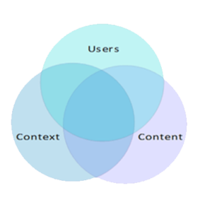
The best way to think about this is as a “system” made up of three components – your target user, your content and the context of that content. Then design your elements taking all three components into consideration.
By practicing solid information architecture best practices, communication with your users is improved significantly.
- Make good use of headlines and sub-headlines
- Practice your wordsmithing
- Use bullet points, rather than long gusty sentences
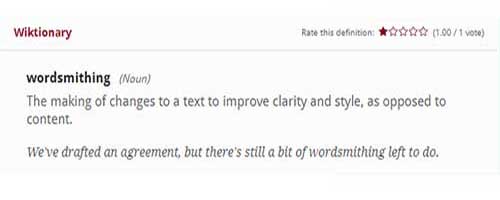
- Wordsmithing –
Learn to write effectively for the internet (wordsmithing). It is a learned skill and requires practice.
In a recent Pardot survey, 97% of consumers said bad content negatively impacted their trust in brands.
Here are a few tips on improving your writing:
- Start with research. Know what your target audience is looking for and then do SEO key word research – this will tell you what Google and your users are looking for.
- Concentrate on strong calls to action. What do you want your visitors to do? Simply getting them to read your content is not going to help you get leads like a good call to action. “Download our free…”, “Sign up for our newsletter…”, “Schedule your free demo…”, etc.
- Like “location location location” in Real Estate, you should “reduce reduce reduce” your content. Write a one sentence summary of your topic, then, as you edit your copy, make sure every sentence supports that summary. Cut unnecessary phrases and words to make your content stronger.
- Shoot for emotion. Don’t think of a tear-jerker book or movie, think of the emotion you want your user to feel regarding problems you can help solve. Read the HubSpot interview on “Why content goes viral.”

- Effective imagery –
I am not quite sure what the image above says to you, but it is interesting and it got your attention…didn’t it?
A picture is worth a thousand words, right? What a better way to reduce your words and evoke emotion than choosing the imagery to support your message.
Finding good images can be a bit tricky…and expensive. You can hunt for free images on the web or take your own photos if you have that creative bent. Images should support well-crafted content, however, don’t try to tell your whole story with them. Plan ahead and be strategic.
Don’t just focus on great photos. Infographics with relevant statistics and facts and clever icons and illustrations can be pretty powerful as well. Again, plan your imagery to support the message you are giving. Here are a few more tips on imagery:
- Over-sized images can be effective as page backgrounds
- If you are putting text on top of a background image, use a color overlay to increase the readability
- Pay attention to the size of your image files – large files reduce page load efficiency. Smaller the better.
- Watch the number of images per page – again, more images can slow your site down. A single second of added page load speed can cause sales drop by 27%.
- Responsiveness –
Make sure your site looks good on all devices (responsive) – from desktop down to smart phone. This should really go without saying, but we are saying is anyway.
According to some reports, 91% of businesses do not have responsive, mobile friendly website designs.
62% of companies increased their sales by designing responsive mobile platforms for their websites. So, how important is responsiveness? Pretty darn.
- Brand adherence (colors and fonts) –
Good branding is a combination of art and science. The goal is to connect to your users on a human level. What the heck does that mean?
Think about how humans naturally recognize other humans. Facial recognition, yes, but also in the way they dress, talk, and other inherent characteristics that make us different from each other.
Think of your brand in these terms, and think of colors and fonts as facial characteristics.
- Colors – do some research on colors. There is a lot of research on what different colors mean. Green for environmental or outdoors. Blue to evoke trust. Orange for haste or impulse. Black for luxury and value. Check out this great article on color.
- Fonts – It may seem like a small thing, but there is science behind it. There is a lot that goes into this so let’s just look at two font families. Picking a font within one of these families may be all you need to consider.
Serif fonts – has a little “curve” at the end of the type face – generally more of a traditional or solemn look.
Sans Serif fonts – smooth and clear, no “curve” – popular among many designers – generally considered modern and contemporary.

- Shorten the “spinning wheel” –
Optimizing your page load speed is very important to attracting and keeping visitors on your site. 39% of the people across the world will stop engaging with a website if images won’t load or take too long to load.
There are many factors that affect the performance of your site. We already mentioned imagery. There are other, more technical aspects of your site design that need to be reviewed.
The recommendation is to discuss this with your provider or find a company or consultant that offers site optimization services.
Focusing on these 7 areas of your website design will provide a very good foundation for a quality experience for your users.
From there, the sky’s the limit!